Miles, my son, is sick. Therefore, I get to stay home with him. However, I will be back tomorrow. Today, be sure you are working on finishing your graffiti piece. Remember, you must have the following elements within your art work:
A 3-d object the is part of the wall photo
A "drawn" component
A photographic part that is from an original photograph (not a harvested one)
Please experiment with the blending options (like color burn, lighten, etc) to make your image a more believable part of the wall.
ALSO!!!!!
Several people did not turn in their Graffiti facts homework. At this point, failure to turn that in will put you in danger of failing on your interim. It is not too late. Get it to me tomorrow for partial credit.
Monday, December 13, 2010
Thursday, December 2, 2010
Exercise: Shirt Tutorial
Here is a link to a tutorial that demonstrates how to add an image to a shirt.
This is the address you can copy and paste in your browser if the link does not work.
Also, you can find a t-shirt image in the "reference" folder. Here is the path to find it.
Wadera - period4 - 1dropƒ - Q2 - Reference - Shirt
You will need to harvest the image you want on the shirt.
This is the address you can copy and paste in your browser if the link does not work.
Also, you can find a t-shirt image in the "reference" folder. Here is the path to find it.
Wadera - period4 - 1dropƒ - Q2 - Reference - Shirt
You will need to harvest the image you want on the shirt.
Monday, November 29, 2010
Homework: Graffiti
Our next project will be a graffiti inspired piece. Please find 10 facts about the history of graffiti and 10 facts about the artist Banksy and 5 facts about another established graffiti artist. Please hand-write your answers and be sure cite your sources.
Due - Tomorrow 11/30 at the start of class to receive full credit.
Due - Tomorrow 11/30 at the start of class to receive full credit.
Wednesday, November 17, 2010
Homework: Color Theory
Define the following terms...
Primary Colors
Secondary Colors
Warm Colors
Cool Colors
Analogous Colors
Complementary Colors
Monochromatic
Tint
Shade
Please hand write your answers.
Primary Colors
Secondary Colors
Warm Colors
Cool Colors
Analogous Colors
Complementary Colors
Monochromatic
Tint
Shade
Please hand write your answers.
Monday, November 8, 2010
Sorry... yet again.
Sorry I am out again today. Because of the Parkinson's I have to meet with doctors pretty regularly. Usually I meet with them after school but today I am meeting with a new doctor whose schedule is annoyingly hard to work with.
I will be back tomorrow.
Sorry again.
Today harvest images for you to use in our next project. You want 5 images to choose from. The images should have a single object as the focus with a background, not a solid color. Thanks!
See you tomorrow.
I will be back tomorrow.
Sorry again.
Today harvest images for you to use in our next project. You want 5 images to choose from. The images should have a single object as the focus with a background, not a solid color. Thanks!
See you tomorrow.
Monday, October 25, 2010
Exercise: Elements & Principles of Design
Your challenge is to find and harvest photographs from the web that exemplify the elements and principles of design. To succeed at this task you need a clear understanding of the elements and principles of design. Save images to your folder on the desk top and be sure to rename your files as the element or principle they represent.
Exercise: Elements of Design
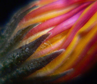
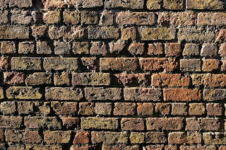
Elements of Design are the building blocks of art. They are the components that are used to make an image. The basic elements are Color, Form, Line, Shape, Space, Texture and Value.
Color
the absorption or reflection of the light spectrum
the absorption or reflection of the light spectrum
Form
the actual or illusion of a three-dimensional shape
the actual or illusion of a three-dimensional shape
Line
the connection of two points
the connection of two points
Shape
an enclosed area; either organic or geometric
an enclosed area; either organic or geometric

Space
the area filled (our empty) within a piece of art
the area filled (our empty) within a piece of art
Texture
how something feels or appears to feel
how something feels or appears to feel

Value
the range of dark to light
the range of dark to light
all photos found at Flickr.com
Exercise: Principles of Design
Principles of Design are how those elements/components are arranged to create a complete piece of art. The basic principles are Balance, Contrast, Emphasis, Movement, Pattern, & Scale.
Balance
the even distribution of visual weight
the even distribution of visual weight
Contrast
opposition of elements of art, for example: light vs. dark
opposition of elements of art, for example: light vs. dark
Emphasis
establishing a focal point
establishing a focal point
Movement
the illusion of activity which leads the viewer’s eye
the illusion of activity which leads the viewer’s eye
Pattern
repetition or consistency of an art element
repetition or consistency of an art element
Scale
the size relationship of the objects within a piece of art
the size relationship of the objects within a piece of art
all photos found at Flickr.com
x
Monday, October 18, 2010
Sorry I Am Out...
...but I am.
Finish up your illustration for balance. You should also start your illustration for pattern. You should be using the same object you did for balance. See you Wednesday!
Finish up your illustration for balance. You should also start your illustration for pattern. You should be using the same object you did for balance. See you Wednesday!
Tuesday, October 12, 2010
Homework: Elements and Principles of Design
The next project is going to focus on the elements and principles of design. Therefore, it might be a good to know what they are. Please define the elements of design and the principles of design. Then find AND define 7 elements of design AND 7 principles of design.
Definitions need to be hand written. Be sure to cite your source to receive full credit. Failure to cite will lead to a drop of a full letter grade.
Definitions need to be hand written. Be sure to cite your source to receive full credit. Failure to cite will lead to a drop of a full letter grade.
Wednesday, September 29, 2010
Project: Surrealist Landscape
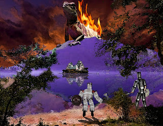
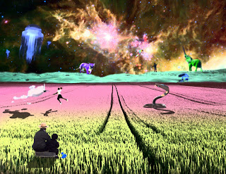
For this assignment the challenge is to create a surreal landscape by juxtaposing harvested photographs. You should use the tools and techniques that you used in your composite exercises ( i.e. - masking layers, hue/saturation adjustment, drop shadows, lasso, quick selection, magic wand, etc ). The image should attempt to tell a story and that story can be expressed through your title.
Here are a few examples...

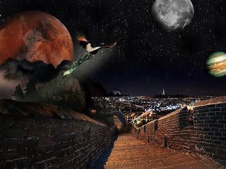
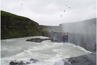

Here are a few examples...


Monday, September 27, 2010
Thursday, September 23, 2010
My Absence
Sorry that I am not there. My son woke up looking like he had pinkeye. Being the nice father that I am I stayed home with him.
Since I am out, I will have you do a homework assignment for our first project.
Since I am out, I will have you do a homework assignment for our first project.
Homework: Surrealism
Find 20 facts. Please hand write your facts and be sure to site your source to avoid losing points. Here is the fact break down...
5 facts about Surrealism
5 facts about Salvador Dali
5 Facts about Rene Magritte
5 facts about Max Ernst
See you tomorrow.
5 facts about Surrealism
5 facts about Salvador Dali
5 Facts about Rene Magritte
5 facts about Max Ernst
See you tomorrow.
Monday, September 20, 2010
Exercise: Composites
For our first exercises we will be using the photos you harvested last week to create some composite image. A composite image is an image that is created by combining two or more photos together. A successful composite is seamless and believable as a single picture.
There are a few terms that are important to understand for these exercises and future ones as well.
Also there are tools that are very important too.
Below you will find 6 composites that you will create your own version of.
There are a few terms that are important to understand for these exercises and future ones as well.
Layer
Opacity
Masking Layer
Opacity
Masking Layer
Also there are tools that are very important too.
Eraser
Paintbrush
Foreground/Background Color
Paintbrush
Foreground/Background Color
Below you will find 6 composites that you will create your own version of.
Exercise: Composite 1: Face Replace
Challenge: Take the face from one person and cover the face of another person.
Exercise: Composite 2: Vehicle Skin
Challenge: Use an animal hide to add a skin/paint job to a vehicle.
Exercise: Composite 3: This Land is My Land
Challenge: Add a full body portrait to a landscape and create a drop shadow to enhance the illusion.
Exercise: Composite 4: Layered Landscape
Challenge: Use 3 different landscape photographs to edit together to create a single landscape image. 1 photo should be used for the background, 1 for the middle ground and 1 for the foreground.
Exercise: Composite 5: Designer T
Challenge: Add an image to a t-shirt and be sure it looks like it has been screen printed on.
Exercise: Composite 6: Group Crasher
Challenge: Take a group shot and add an extra person to the picture. Additional person should blend in with original photo.
Sunday, September 12, 2010
Homework: Harvest
We will be collecting images to use for our first Exercises. Please "harvest" the following images...
5 Head shots - a person shoulders and up
5 Full body shots - head-to-toe photo of a person
5 Articles of clothing - sneakers, t-shirts, etc
5 Group shots - at least 2 rows of people
5 Vehicles - complete photo of car, boat, plane
5 Landscapes - photo of an environment
5 Animals - head-to-toe photo showing the complete animal
All images should be in color and an actual photograph. Images should be saved in your "Harvest" folder that you created in class, within the folder on the desktop.
5 Head shots - a person shoulders and up
5 Full body shots - head-to-toe photo of a person
5 Articles of clothing - sneakers, t-shirts, etc
5 Group shots - at least 2 rows of people
5 Vehicles - complete photo of car, boat, plane
5 Landscapes - photo of an environment
5 Animals - head-to-toe photo showing the complete animal
All images should be in color and an actual photograph. Images should be saved in your "Harvest" folder that you created in class, within the
Monday, September 6, 2010
Say "Hello"
For your first comment assignment I work like you to simply leave a comment, in which you say "Hello."
A few key points to remember...
To comment, you must use the "Name/URL" login, but you should not fill in a URL.
Always make sure that you use your first name and last initial. Anonymous comments will be deleted.
Simply doing what I say will only get you a "B." Creativity will always boost your grade!
Welcome!
Welcome to the web log developed for digital arts period 4.
This blog is going to be used to look at digital art examples and to comment on them. Your comments on this site will count towards your comment grade. Comments can be submitted via this blog or in written format during class. Comments can be simple ("I like it," "I don't like it," etc.) but I may reply to your comment for further feedback ("What do you like about it?" "What would you change?" etc).
You will also be able to share digital art examples you find on the internet with the class. Be respectful and considerate, any inappropriate use of this blog will result in a zero for your comment grade for the semester and any applicable discipline code consequences.
Welcome again and enjoy!
Subscribe to:
Comments (Atom)


